Transforminginvoices,bills,andreceiptsintoactionablefinancialinsights.
SnapCost is an AI-powered expense management platform designed for households, freelancers, and small businesses. The idea emerged from a simple observation: most people want better visibility into their finances, but very few are willing to spend time manually tracking expenses. As Founder and Product Designer, I was responsible for defining the product strategy, user experience, brand, business model, and go-to-market approach.

Understanding the full picture.
People receive invoices from electricity providers, internet companies, insurance companies, subscriptions, freelance work, and dozens of other sources every month. The information exists. The problem is that organizing it requires effort.
Most people start tracking expenses with good intentions, but eventually abandon the process because it becomes another task on an already busy schedule.
The goal behind SnapCost was simple: Upload a bill. Let AI do the rest.
By eliminating manual data entry, the platform helps users gain visibility into their finances without creating additional work. Built on Next.js with OpenAI for document parsing, Supabase for data and auth, and Stripe for billing — the product is a fully functional SaaS, not a design prototype.

How can we make personal finance tracking feel effortless?
users are expected to classify every transaction themselves, turning tracking into a chore
most tools require extensive setup before delivering any value
financial products often prioritize data density over clarity, overwhelming casual users
the value of tracking only materializes if users keep doing it consistently, which most don't

Beyond interface design.
SnapCost wasn't simply a design exercise. It was an opportunity to explore the full product lifecycle — from idea validation to product launch. My responsibilities spanned strategy, design, and growth, giving me a deeper understanding of how design decisions connect directly to business outcomes and user acquisition.
- Product strategy and MVP definition
- UX/UI design across the full platform
- AI feature design and prompt engineering
- Brand identity and visual language
- Landing page and conversion design
- Meta advertising campaigns
- Pricing strategy and plan structure
- Product positioning and messaging
- Multi-space architecture for households
From understanding to execution.
Designing an AI-first experience
Traditional finance products begin with forms. SnapCost begins with a document. The challenge was creating an experience where users could simply upload a file and immediately receive structured information without needing to understand the underlying technology.
- Every interaction designed around one principle: the AI should feel invisible
- OpenAI-powered parsing extracts provider, amount, dates, and billing periods automatically
- Validation mechanisms let users verify and correct extractions without breaking flow
- Batch upload support for processing multiple documents in one session
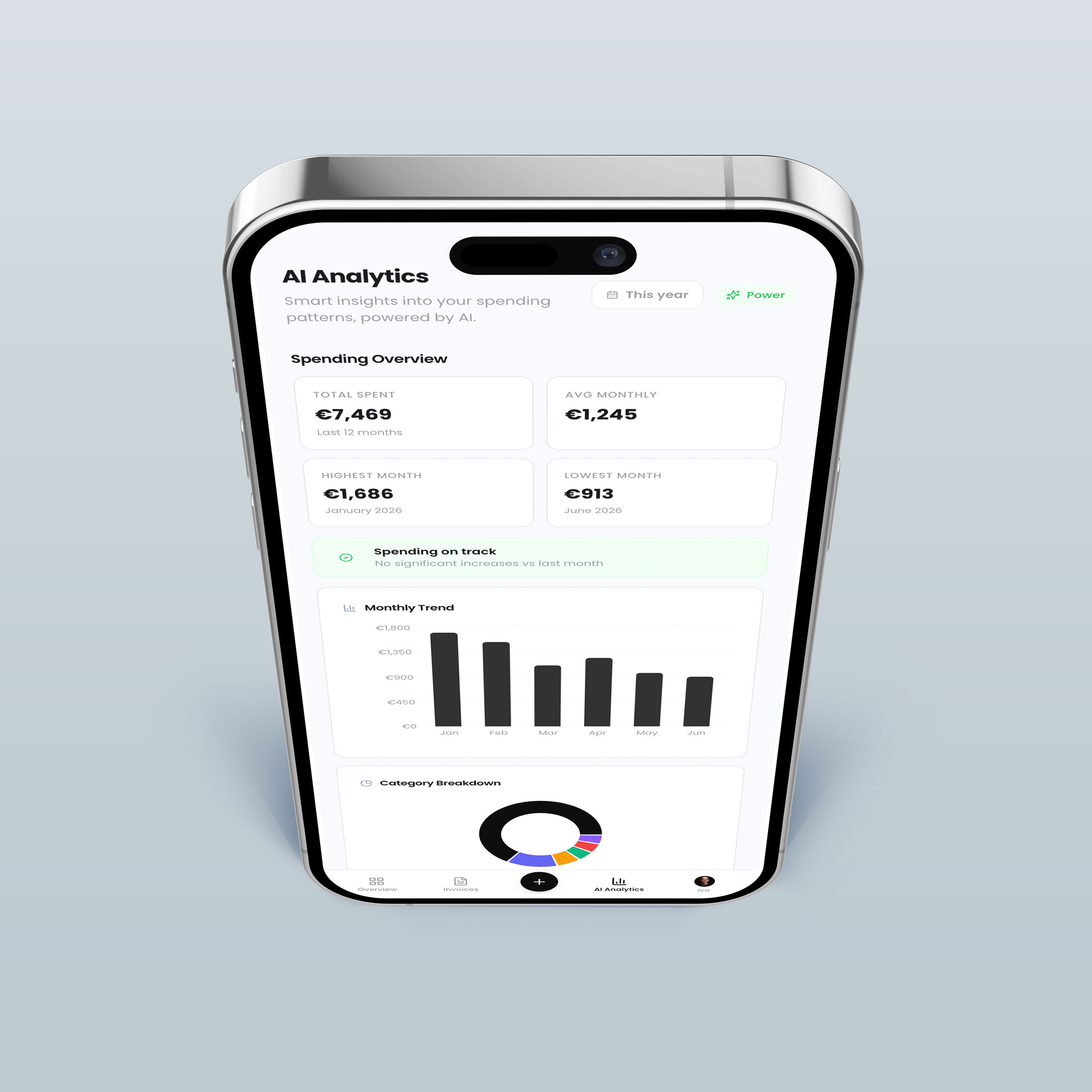
Making expense data actionable
Collecting invoices isn't useful by itself. Users need answers. Instead of presenting users with spreadsheets or raw numbers, SnapCost transforms information into actionable insights and trends.
- How much am I spending every month?
- Which categories are increasing?
- Where is my money going?
- What changed compared to previous months?
- AI-generated insights that surface anomalies and opportunities to reduce costs
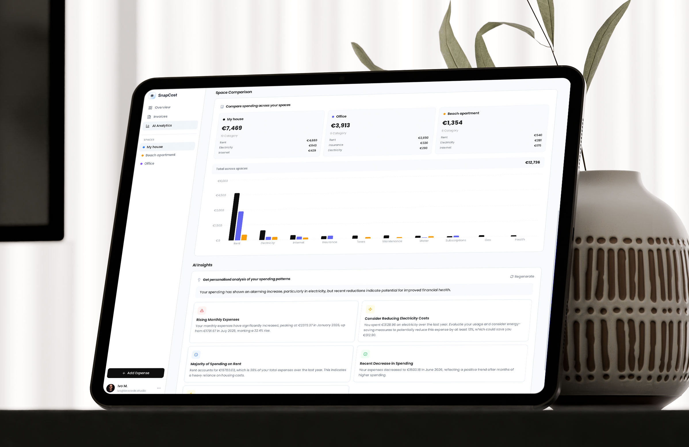
Multi-space architecture
Many users manage expenses across multiple contexts — a personal apartment, a family home, a rental property. Rather than forcing everything into one view, SnapCost introduced a hub system that lets users track and compare expenses across independent spaces.
- Each space has its own categories, providers, and expense history
- Cross-space comparison charts for side-by-side cost analysis
- Space-level permissions for shared household management
- Category grouping by name across hubs for meaningful comparisons
Going deeper.
Building Trust Around AI
Financial products require confidence. Users need to understand where information comes from and why the platform extracted specific values.
One of the key design challenges was balancing automation with transparency. The experience was designed to allow users to benefit from AI-powered categorization and extraction while maintaining confidence in the accuracy of the results.
This required careful attention to feedback loops, validation mechanisms, and the visibility of source data throughout the experience. Users can always view the original document alongside the extracted data, edit any field the AI populated, and see confidence indicators for ambiguous extractions.
The result was an experience that feels automated without sacrificing trust.
From Idea to Launch
Rather than spending months building a large feature set, the focus was on validating the core value proposition as quickly as possible.
This included creating the brand and positioning, designing the marketing website, launching Meta advertising campaigns, gathering user feedback, measuring acquisition and activation, and iterating based on real-world usage.
The platform launched in three languages (Portuguese, English, Spanish) from day one, targeting Southern European markets where household expense tracking tools are underserved.
The objective was to learn as quickly as possible and continuously refine the product based on evidence rather than assumptions.

Great products remove effort.
Users rarely want more features.
They want fewer tasks.
The most valuable innovation wasn't adding new functionality.
It was removing friction from an activity people already needed to do.
The best AI features are the ones users don't notice.
Hypercard
Employee Credit Card & Perks